Sunday, June 20, 2010
Sunday, June 6, 2010

Saturday, June 5, 2010
LOSING ALTITUDE - THE SCALING BACK OF VERTIGO

Earlier this week, Bleeding Cool reported that DC has decided to take several properties and characters away from Vertigo, namely those that originated in the DC universe. Characters that fall under that umbrella include Swamp Thing, but also Constantine, Sandman, and a lot more. Taken by itself, this new is a bit revolutionary, although not cause for great alarm, but when coupled with other recent announcements, it could mean a potential scaling down of Vertigo. Hit the jump to see some speculation on my part based on recent news and interviews.

Welcome to another edition of the Moments of the Week! It was a pretty small week in terms of books coming out, but we still had some pretty important moments showing up, such as Iron Man and Captain America arguing in Avengers: Prime, more mysteries developing from Brightest Day, and others. There is quite a bit of gore porn going on (as usual), but we shall counter that with the cutest scene ever. What am I talking about? You are going to have to hit the jump to find out.
Avengers Prime #1

Steve Rogers and Tony Stark face off in the ruins of Asgard, moments after the events of Siege. And yet, somehow, Tony already knows that Steve is going to be "the new Nick Fury". Precognition powers or continuity error? I think we know the answer to this one: BENDIIIIIIIIIS!
Transistors: the answer to everything!

Oh just Steve Rogers being his awesome self.
Brightest Day #3

Man, The Free Willy sequels really took a turn for the worse after the second one. Seriously though, the image of Aquaman getting mauled by an orca made me laugh out loud.

The implication here is that Ronnie Raymond knew what he was doing all along when he turned that girl into salt, and the whole time he was a Black Lantern. What do you guys think?

I'm going to spare you the "HEY KIDS, COMICS!" joke, and just point out that one of the corpses shown here, that were completely skinned, is from a teenage girl that was shown in the previous issue playing video games. You stay classy, DC. (cue the haters)
Captain America/Black Panther: Flags of our Fathers #3

Armless Tiger Man, the sensational character find of 2010. Or is he really a character from the Golden Age? Either way, completely ridiculous.
Franken-Castle #17

We all knew that Frank Castle would eventually go back to his former self sooner or later, and we see some of that seeding here. The Bloodstone, which has regenerative powers, is inserted into his body.
Invincible #72

Looks like the latest issue of Invincible was really... gut wrenching.
Joker's Asylum II - The Riddler #1

The Joker: Worst. Roommate. Ever.
Red Hood: The Lost Days #1

Jason Todd totally Kill Bill-ed his way out of the grave, apparently. I also wanted to mention Pablo Raimondi's artwork here, which looks absolutely spectacular here. He's much better suited to real life stuff than the space opera they had him doing in Realm Of Kings: Inhumans.
Red Robin #13

Oh no he didn't! He brought up the pixie boots!
The Thanos Imperative #1

Kirk mentioned some of the issues with the art and the coloring in his review of this book, but I also wanted to mention something else: What the hell is up with Groot? It feels like Miguel Sepulveda didn't know how to draw him, so he avoided having him throughout the issue (he only shows up in three or four panels at most), and he looks like crap in all of them. Not to mention he looks pretty small, considering other artists depict him the size of a small hill.

I have to admit, this is a pretty awesome splash page, and a demonic version of the Defenders with Namor, Doctor Strange, and the Hulk plus the others would make just about anyone crap their pants. That being said, if I am allowed to put on my nerd hat, we had already seen a Hulk, in the Realm of Kings one-shot, and he looked nothing like this, plus he was killed by the Revengers! Tut tut, DnA!
Thor and the Warriors Four #3


The Corporate Shake-Up

Vertigo has always been Karen Berger's baby
During the restructure of DC comics last year, there was one very big surprise: Karen Berger was not part of the new head office of the DC that is now made up of Diane Nelson, Jim Lee, Dan Didio, and Geoff Johns among others. Berger handled the Vertigo ship since it's inception in 1993, and has been responsible for a plethora of critically acclaimed and commercially successful comics, including several that have been turned into films and other media, not to mention working as a fertile ground for upcoming and hot new creators and being a key factor in introducing comic book collections and graphic novels into the bookstore market. The importance of Vertigo cannot be understated, both commercially and in the advancement of the art form. You would figure that during the establishing period of the new DC corporate organization, Berger would be rewarded for all her hard work. Did Berger get the raw end of the deal during this shake-up? Did that chill the relationships between the editorial offices?
The Direct Market

"I would like to see more focus on the periodicals"
In recent interviews, editors from DC have said that they wanted to concentrate more in the direct market, with the hopes of beating Marvel who is currently the leader in that front. More specifically, as the quote above signals, they want to concentrate on the periodicals. You know what titles have notoriously bad sales in the periodical direct market? Vertigo. Of course, to say that Vertigo titles are not commercially successful would completely remiss, as their titles usually do extremely well outside of the direct market, notably in book stores with their collections. Recently, Vertigo has started releasing original graphic novels, such as Area 10, Noir, and more, with several set for release in the future. Maybe Vertigo will start switching slowly to releasing material in the format, since it's the one preferred by the majority of their readers?
The CMX Effect

Over the course of the last six years, CMX has brought a diverse list of titles to America and we value the books and creators that we helped introduce to a new audience.
Of course, these news come hot on the heels of the closing down of another imprint over at DC, the CMX manga imprint. Much like Vertigo, their titles do not perform well in the direct market (though with the extra baggage of not being able to compete very well with other manga). With the kind of heat that the move earned among the fans, and with aforementioned worth of the Vertigo, it's very unlikely that the imprint would close down. That being said, it is a definite sign of the fact that the company is modifying and altering venues that are not profitable in the short term. Also worth mentioning is the recent change in structure to the way that Zuda works, which has dropped the competition aspect of it.Yet another symptom of the fundamental changes that are going on in DC. Will DC change Vertigo's publishing plans? As an effect of the tough economic situation, could Vertigo be on the receiving end of a cutback in their staff or resources?
The Past

"I think Vertigo has always been about just shaking up the status quo, telling stories that [make] you really think in a variety of genres."
And finally, all the characters that were originally DC's, though published under the Vertigo imprint, are going back to the main universe. During the early days of Vertigo and proto-Vertigo, many characters were originally introduced in DC, or Vertigo made popular reinventions of them, making them fresh or interesting again. Besides the aforementioned characters, this also includes other titles like House of Mystery, Unknown Soldier (which recently got a cancellation notice) Madame Xanadu, and if you want to get technical maybe even The Losers, among others. The most troubling one is perhaps Constantine, which is Vertigo's longest running title, with over two hundred issues so far. Removing all of these properties from the Vertigo imprint would be quite a blow, and reduce Vertigo's current output. It would also mean that all of the Vertigo titles left wold be creator owned, so if some kind of adaptation is made out of them, I'm not sure if DC gets any financial gain out of those.
The Future

"There's a flavor, there's a need, there's a tone to those type of stories, and we're going to make sure we keep doing them"
So where would that leave Vertigo? With less established properties to draw from, they will have to concentrate more on new creations. This is not completely a problem, as recent new titles like American Vampire, The Unwritten, Fables and Scalped have proved to be quite popular and critically acclaimed. Of course, completely foregoing the floppy format in the direct market could potentially be a problem, and something very unlikely for an American publisher of this size. Less resources is something that no company wants, and what could probably hit Vertigo the hardest.
Where do you think Vertigo is going to go next? Where do you want it to go? Do you think we'll hear more about the future of Vertigo this weekend t HeroesCon? Let us know what you think in the comments section.
The Thanos Imperative #1 Review *Spoilers*
Posted: 03 Jun 2010 10:42 PM PDT

After releasing a primer on this event earlier today, you probably should have expected me to come back with an image and spoiler heavy review of the first issue of The Thanos Imperative. Hit the jump to find out how the first issue holds up!
 THANOS IMPERATIVE #1
Written by Dan Abnett and Andy Lanning
Art by Miguel Sepulveda
First off, this issue reminded me a lot of Annihilation in both scope and tone. We've got an army from another universe invading ours, all the heavy hitters - Thanos, Nova, Silver Surfer, Drax, Gamora, Gladiator, etc - involved, the prelude issue featured a huge reveal and kicked the war off with a bang last week and we even get a flashback to the original Annihilation to start the issue off.
Where both Annihilation: Conquest and War of Kings were sort of their own events and had their own themes and pacing, this is the first one that has recaptured that magic of the first Annihilation for me. Both were good in their own right and went their own way, but neither felt like a true sequel to Annihilation. Thanos Imperative does.

Rocket Raccoon threatens the weakened Thanos with the prospect of endless life.
One thing I think Dan Abnett and Andy Lanning have managed to perfect over the course of their previous two events is the art of juggling their ensemble cast. There's a lot of people involved in this event and lots of bases to cover. They skillfully jump back and forth between these characters, always giving us just enough pages and information to make each moment matter without dragging down the story or creating jarring shifts in narrative. Every page feels important on some level and like the content we are getting matters and that's something many events struggle with delivering. Every event can manage a big splashpage or shock death or stunning reveal. Few can keep the story between these moments just as engaging.
If you read last week's Thanos Imperative: Ignition, you're familiar with the story. Adam Warlock/Magus destroyed several Universal Church of Truth planets and the faith power they had stored up in an effort to breach The Fault and make way for the arrival of his lord, the evil version of Captain Mar-Vell from the Cancerverse, the universe found on the other side of The Fault during the recent Realm of Kings storylines. This universe is one in which life has won out and now grows out unchecked like a cancerous tumour. They've literally filled their universe with the twisted, Lovecraftian monsters and doppleganger versions of our heroes and are looking to metastasize into ours. But first, they have to kill death in our universe or, at least, the Avatar of Death, presumably Thanos, though there are hints given here that he may not actually be the true avatar.

Meet The Revengers - evil versions of our Avengers from the Cancerverse
This issue continues the story set up in Ignition by showing the aftermath of The Fault armies invading our universe. The Kree and Shi'ar armadas stationed at The Fault were nearly decimated in the explosion set off by Magus and are now shown struggling against the Cancerverse monsters.
While the two empires deal with the initial onslaught of The Fault forces, the Guardians of the Galaxy were shown dealing with Thanos, who broke free of his restraints in Ignition. I loved this scene primarily for the Rocket Raccoon moment. Thanos had Starlord in a death grip and was about to kill him before Rocket Raccoon showed up in a power suit. He knew the suit wouldn't kill Thanos and told him as much. However, he tells Thanos that the suit will disable him in his weakened state long enough for them to drop him off at a nearby black hole. Yes, Rocket knows Thanos's weakness - he doesn't want to live. The event horizon would ensure Thanos lived an endless life and be unable to die. It was a great scene and captured what made both Thanos and Rocket great characters.

A quiet moment of contemplation for the Silver Surfer as he observes the fallout of the war at The Fault.
Another stunning moment in its simplicity was the arrival of the Silver Surfer. We were following the battle at The Fault between our universe's protectors and the Cancerverse's initial wave of monsters. This is a losing battle for us and we see each group taking heavy losses and the chaos that is ensuing. This is then juxtaposed with a zoomed out view of the conflict from the Silver Surfer's perspective light years away. Like I said, it's a simple scene, but powerful in its execution.
From here, Abnett and Lanning move the story forward at breakneck speeds. The Guardians of the Galaxy learn of the conflict at The Fault and decide to enlist Thanos's aid in stopping it. Thanos gets his old yellow and blue costume back and even Drax gets in on the retro look with a new costume based more on his older green and purple Drax costume instead of the Vin Diesel look he'd been sporting. The two even have a great moment where they acknowledge Thanos's death at Drax's hands in Annihilation while poking some fun at the nature of death in comics. The issue ended with the group using Knowhere's teleporters to enter the Cancerverse for some unknown reason (it's not explicitly stated why they go or what they are looking for), but are immediately confronted by that universe's evil version of the Defenders.

It's rare that a preview page for the next issue can overshadow everything else in a comic, but with a page like this, it'd be hard for almost anything to top it.
There was one more thing that made this issue special for me and it was the sketch previews for issue two found at the back. In a word, these are epic. I loved this first issue and it had me believing it was the true successor to the original Annihilation, but these preview pages were absolutely amazing. The most pertinent one to mention is the splashpage featuring Galactus, Tenebrus and Aegis all united together and shown destroying The Fault forces. I don't know how anyone could see this page and not be excited or left in anguish over the fact we have to wait another month for the next issue.
Final thing worth touching upon is the art. Miguel Sepulveda does some nice work here, but I felt it was a little inconsistent. There are moments it looks stunning, like with the Silver Surfer moment or any pages with The Fault forces, such as the Revengers or evil Defenders, not to mention that Galactus preview page, but there are others, like the early Guardians of the Galaxy pages and some of the Shi'ar and Kree moments, that look rushed or like someone else drew them, particularly when it comes to facial expressions. Overall, I'm quite happy with the art, but it's no Paul Pelletier (War of Kings) or Andrea Di Vito (Annihilation) either.
RYAN THE IOWAN 34

It’s a short week for the Comic Book Review Power Rankings, but we’ve got quantity over quality as all five of this week’s comics are definitely worth a read. With a short stack, it is always a fierce battle for Book of the Week honors, but only one can talk away with the top spot. Will it be the debut of Marvel’s Hawkeye and Mockingbird? Or perhaps it is the conclusion of Mice Templar: Destiny? Heck, it might even be the first issue of the Sky-Doll: Spaceship Collection anthology. There is only one way to find out—that’s to hit the jump and read on!
For the uninitiated, the Comic Book Review Power Rankings is a countdown from worst-to-best of my weekly comic book haul. Before reading the issues, I preRank them based on the creative team, previous issues, solicitations, and gut instinct. The final Ranking number is based upon how the issues actually turned out. I attempt to keep everything as spoiler free as possible, but keep in mind that there may be the occasional minor spoiler that I overlook. As always, I can be reached via responses to this thread or at ryanreviews@gmail.com.
 05. HAWKEYE AND MOCKINGBIRD #1
Written by Jim McCann
Art by David Lopez, Alvaro Lopez, and Nathan Fairbairn
Letters by Cory Petit
Cover by Paul Renaud
preRanking: 05
• If this weren’t such a short week, I don’t think I would have tried out the debut issue of Hawkeye and Mockingbird, as I hate to add another title to my pull list, but general curiosity and a love for the original Hawkeye miniseries that introduced Mockingbird got the best of me and so I picked it up.
• This is a solid debut issue with writer Jim McCann focusing mainly on introducing the current status quo for the characters, including Mockingbird’s new spy agency, while simultaneously setting up two villainous threats.
• I think the major draw on this series is going to be Hawkeye, but if you aren’t up to speed on Mockingbird’s history, it is easy to get lost on the details here without reading the retrospective on the characters at the end of the issue.
• The main problem with the issue, though, is the pacing. The narration from Hawkeye and the dialogue with all of the characters is super thick, which throws off the pacing, especially during the action-packed moments at the beginning of the issue. That disconnect pulled me out of the issue several times.
• McCann has a way with the characters though, as everyone has super strong personalities that really carry this issue. I was especially impressed with the interlude between Hawkeye and both Captain Americas, which had a great “boys’ club” feel that was a nice change of pace.
• I haven’t seen much from David Lopez and Alvaro Lopez since their stint on Catwoman, but I’m glad to see that they haven’t lost a step since then.
• The level of detail does fluctuate quite a bit on the backgrounds, but the main character work is really solid and I dig their approach to storytelling.
• The story is built on a pretty standard grid approach, but the artists put some twists on how those grids are laid out, which kept things fresh throughout the issue.
• The only major issue I had with the art is the weird chins that plague the issue. Everyone from Hawkeye to Captain America to even Mockingbird has a Jay Leno-esque chin at least once in this issue, which isn’t something I cared for.
Verdict: Check It. This issue just barely missed the mark for a Buy It verdict, mostly because of the awkward pacing that made it hard to trudge through on my first read-through and the prerequisite knowledge of Mockingbird’s history that you really need to have to get the full extent of this issue. I really dug McCann’s approach to the characters through and the art team worked well with him. This is certainly a fun issue that has me convinced to come back for more as this series has loads of potential.
 04. SKY-DOLL: SPACESHIP COLLECTION #1
Written by Barbara Canepa and Alessandro Barbucci
Translated and Adapted by Matteo Casali and Jim McCann
Art by Mateo De Longis, Claudio Acclari, and Pierre-Mony Chan
Letters by Clay Cowles
Cover by Barbara Canepa and Alessandro Barbucci
preRanking: 03
• Sky-Doll returns this week with The Spaceship Collection, an anthology of stories loosely related to the original comic that flesh out the world of our heroine Noa without being bogged down by oppressive continuity or the heavy themes of the original story.
• As a HUGE fan of the original story, I really dug this, but it is worth noting that it is absolutely essential that you have some familiarity with the franchise before approaching this comic or you are going to be totally lost.
• You wouldn’t think that it would make that big of a difference, but the change from CB Cebulski to Jim McCann as the adaptor of the comic does affect the tone and cadence of the writing. It’s not a major issue, but it is noticeable.
• The lead story of this comic is the weakest as it is much harder to follow than the others because of how much is left unsaid. Its darker themes of abandonment and tragic existentialism are more in line with the original, but don’t quite gel as well with the lightheartedness of the other stories in this collection.
• In terms of art, Mateo de Longis’s work is a very close fit to the original as he rarely strays from the style set by Canepa and Barbucci.
• The second story, which riffs on the old west (but with lasers) is incredibly goofy and a major departure in tone for the series. It’s incredibly fun, but feels out of place in the larger picture.
• The art took some getting used to as the flat, bleeding colors are far more European than I’m used to, but once I got the hang of it, it had a cool, almost graphitti-like quality to it.
• The third story was certainly the strongest as it felt to be a direct extension of the original, focusing on Noa’s time at the brothel with other Dolls. It’s a bit more frantic and has a lighthearted tone similar to the second story. The solid character work and fun approach made it the most well-rounded of the three stories and the amin draw.
• The art in the story has a very Eastern look, aping the stereotypical feel often associated with manga. It’s look and energetic with great expressions and a perfect fit for the story.
• The comic is then rounded out with a great production design and some fun concept art in the back matter.
Verdict: Buy It. For fans of the Sky-Doll franchise, this is a nice “distraction” while we wait for the fourth chapter in the ongoing story by creators Barbara Canepa and Allessandro Barbucci. It doesn’t quite live up to the standards of the original, but is still a very fun comic and something that should appeal to the desired audience. Personally, I think it would make a great addition to a Sky Doll omnibus, should Marvel and Soliel choose to release one.
03. THANOS IMPERATIVE #1Written by Dan Abnett and Andy Lanning
Art by Miguel Sepulveda and Jay David Ramos
Letters by Joe Caramagna
Cover by Aleksi Briclot
preRanking: 02
• Spinning out of last week’s Thanos Imperative: Ignition, Marvel’s newest cosmic even kicks off this week with nearly all of Marvel’s prominent cosmic heroes find themselves pitted against Lord Mar-Vell’s forces from inside The Fault (the “Cancerverse”) as the Guardians of the Galaxy form an unlikely alliance with Thanos.
• This issue kicks off with a lot of action and flows cleanly from page one into a great cliffhanger thanks to its absolutely superb pacing. Dan Abnett and Andy Lanning make it clear from page one that this is meant to be a blockbuster as they never let up from cover to cover.
• Not surprisingly, you get great character work all around with a huge cast. Of course, it helps that DnA have spent the last few years finely crafting all of Marvel’s cosmic characters to the point that even throwaway lines from guys like Karnak have tons of personality.
• The only moment in the entire issue where I would say the character writing could use some work was the opening scene with Star-Lord and Nova, which felt a bit clunky and awkward. Beyond that, however, this is DnA at their finest.
• For example, the scene where Rocket Raccoon threatens and successfully intimidates Thanos while wearing a BioShock-esque exoskeleton. In that scene, DnA get to the heart of the characters and manage to really boost Rocket without shortchanging Thanos.
• Or, in my favorite moment of the entire issue, they have Thanos offering up his thanks and respect to Drax for killing him during Annihilation. It is a scene you’d never expect and that, in theory, would never work, but DnA pull it off superbly.
• In terms of writing, this is right up there amongst the finest issues that this writing team has put together. If you dig their work (which you should), this will be right up your alley.
• The problem with the issue lines in the art, which is unfortunate, because there is absolutely no reason for this problem to exist, nor is there any reason that we should know that it is a problem in the first place.
• If you look at the art on its own, it is pretty solid. The designs are strong and the storytelling works extremely well. Miguel Sepulveda holds his own throughout the issue and does a solid job of working with a large cast and a very insane concept.
• When you look at the pencil-only previews for issue #2, however, you realize exactly how much is lost in this issue when it is colored. It looks like the colors were done directly overtop the pencils, which takes away loads of detail and a lot of the style that Sepulveda brings to the table.
• I honestly would have had no idea what the art was capable of and wouldn’t have minded what we got were it not for these preview pages, but after seeing them, I can’t help but feel disappointed by the end result.
• I think if an inker was brought in to tighten up those details and separate the line work from the art, this would be a vastly different and vastly more impressive issue.
• I’m not going to lie, though, the double-page spread of Galactus and pals from the preview pages was one of the coolest things I’ve seen all week and I’m glad that we were able to see it in its rawest, and potentially finest, form.
Verdict: Buy It. I really want to give this issue a Must Read and I’ll probably regret holding it back at Buy it, but after seeing what the potential of the art, I can’t help but feel that the coloring in this issue was a large enough miss that it drags down the entire issue. Don’t get me wrong though, this is still an amazing issue with some awesome action and some of the finest character moments DnA have ever written. You shouldn’t miss it, but be warned about the art.
 02. RED ROBIN #13
Written by Fabian Nicieza
Art by Marcus To, Ray McCarthy, Mark McKenna, and Guy Major
Letters by Sal Cipriano
Cover by Marcus To
preRanking: 04
• Prior to Batman RIP, Fabian Nicieza made the Robin solo series one of the best comics DC was producing as he closed out the series so that Chris Yost could launch Red Robin. Nicieza comes back to Tim Drake this week and proves that he has not lost a single step in the last year.
• In Nicieza’s first issue back, Tim reflects on the good place that his life finally is in as he starts his new mission to completely clean up the streets of Gotham, starting with gang leader-turned ally-turned threat Lynx.
• This issue felt like an extension of Yost’s run as Nicieza picks up a lot of direction and plot threads from the first twelve issues while still going in his own direction that is an extension of his final few issues of the Robin ongoing.
• The character work here is incredible as Nicieza slips back into writing Tim without a single problem. He just “gets” the character and makes it clear from the get go what his concept of the character is in this issue.
• I dig that, without upsetting the cart, we relearn the character’s world view, his relationships, and his particular commitment to being a superhero. Nicieza does a brilliant job with the transition.
• Marcus To has immediate chemistry with Ncieza, thanks in part to how well the script transitions between writers. I think we’ll see the same success with this creative team as we did the last.
• To’s storytelling and pacing here as fantastic, as he works in perfect sync with the script to beuild intensity from the lighthearted early scenes towards some great action and the very determined focus of the final few pages.
• What really impressed me, however, is how well To expresses the tone of the issue without having to alter his style. While thematically this feels like an extension of Yost’s run, it has a unique tone and To finds it quickly without abandoning what worked well for him in the previous issues.
Verdict: Must Read. Transitions from one very strong run to a new creative team tend to be some of my least favorite issues; it seems like the more I liked the previous direction, the harder it is for me to stay entertained while the new creative team finds its legs. That doesn’t happen here. In fact, there isn’t a moment where I even remotely lost interest in Red Robin while reading this issue. Nicieza jumps immediately into old form as he picks up the reigns on Tim Drake, firmly establishing the new direction of this issue while still spinning out of Yost’s superb run. This issue works on nearly every level and you’d be a fool to miss it!
 01. MICE TEMPLAR: DESTINY #9
Written by Bryan J.L. Glass
Art by Victor Santos and Veronica Gandini
Letters by James H. Glass
Cover by Michael Golden
preRanking: 01
• I’ll admit, I’m a junkie for Mice Templar. I’ve loved this series from the very first issue and is always at the top of my recommendations to folks looking for a new comic to read. That being said, I also hold the comic to ridiculously high standards. Sometimes, I even have my doubts that the series can live up them. Then an issue like this comes along and proves that I had absolutely no idea what the franchise is capable of and shows me that my already insanely highly standards simply weren’t high enough.
• In the final issue of this volume, Karic unleashes his attack on the Snake God in his desperate and dangerous attempt to save his family and friends that were abducted from Cricket’s Glen in the very first issue of the very first volume of this series. Meanwhile, the many subplots all come together as plans are hatched, foiled, and created in a densely packed and exciting issue.
• This is certainly one of the most intense issues of the entire year. It’s so intense that I’m amazed that the creative team was able to keep everything so focused as it shifts from scene to scene, covering an absurd amount of story and conveying so much chaos. Kudos to them for keeping this issue under control without sacrificing that intensity or that chaos.
• There isn’t a ton of dialogue in this issue, but what little dialogue there is shows how rich and bold the cast of this series is. Not every character has a lot of chances to shine, but Bryan Glass makes them stand off with poignant dialogue that keeps the story moving forward.
• Everything about this issue screams EPIC. This is just a HUGE story with HUGE moments, HUGE action, and HUGE characters. For a story that started about a quiet little village, its amazing how big it has gotten without ever losing any of its charm. Glass has been building to this issue from day one and he does not disappoint.
• The art is what wins it for this issue though as Victor Santos puts on a career-making showcase. No one can ever doubt Santos’ ability or potential after looking at this issue…EVER.
• Santos takes advantage of the expanded page count by using larger, more action packed panels as well as lots of great splash pages and some of the best looking spreads of the years.
• When dealing with animal characters, it is difficult to display strong expressions without making the characters too human. This is not a problem for Santos as his expressions transcend the fact that he is drawing mice. He doesn’t try to slap human expressions on them, but instead draws some of the best mouse expressions you’ll ever see.
• I also really, really dig that Santos thinks outside the box with his inventive approach to layouts and storytelling. The structures of the pages themselves become part of the story here. It’s hard to explain without having an example to show you. You really need to just buy the comic for yourself and revel in its storytelling glory.
• A lot of credit for the success of the art belongs to colorist Veronica Gandini, whose bold color choices and fantastic textures really bring Santos’s line work to life.
Verdict: Must Read. As I said in my first bullet point, I hold Mice Templar to an almost unnecessarily high standard compared to most comics that I read each week and I have never been disappointed as Bryan Glass and company always meet and often exceed those expectations. They have never exceeded my expectations quite like this. This is simply incredible comic book storytelling from start to finish as every single member of the creative team puts forth one of the finest works of their respective careers. As this phenomenal franchise closes out its second volume, the bar has been raised even higher thanks to this issue, not only the Book of the Week, but one of the finest comics of the year.
Thursday, June 3, 2010
Subscribe to:
Posts (Atom)
BAD BOY

OLD SCHOOL

GALLERY 33
| |||||


HELLBLAZER
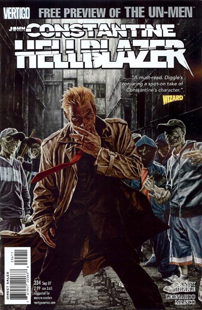
JOHN CONSTANTINE